


Understanding the Histogram in Photography
What is that graph trying to tell you?! Learn how to read exposure and colour values on photography histograms so you can improve your photos!
By Greg Cromie
In this article, we’re going to spend some time understanding the use of the histogram in modern photography.
We’ll discover the purpose of this crazy graph and, most importantly, how to read one.
With this knowledge, you can better understand how histograms relate to the images you take.
What’s more, we’ll discover how to use a histogram to improve your photographic compositions.
So let’s get started.
What Is a Histogram in Photography?
With the advancement of digital camera technology, histograms have become a fundamental tool in the pursuit of perfect images.
Almost every quality photo editing application will include some way to host a histogram. And now, modern digital cameras are starting to adopt this technology for optimised in-camera purposes.
For a lot of people, a histogram is an exciting but confusing graph that appears when editing images. For the most part, those new to photography can get by without even referring to it.
As mentioned, it’s a style of graph that clearly and accurately displays the tonal values of a scene (in-camera) or an image (in editing applications). In essence, a histogram represents the tonal values of an image and shows exposures and even colour values.
Knowing how to read one is a handy skill, especially if you want to optimise your knowledge and success with exposing images correctly.
How Do You Read a Histogram in Photography?
A histogram within a camera is handy, but in an editing application, it’s far more reliable and provides a higher level of information.
The horizontal axis of the graph plots the brightness (exposure) or tonal values of a single image.
The vertical axis maps the volume of pixels in the image and their spread across the horizontal axis. You could also consider the vertical axis as representing the strength of the exposure.
What’s great about a histogram is that as you adjust colour, exposure and tonal values in an app, the information within the graph shifts to match those changes.
While looking at a histogram may cause unwanted flashbacks to high-school math classes with Mrs Sorjenbaker, it’s pretty easy to read one.
The first thing to understand is that the black tones are represented on the left, and the white tones are on the right of the histogram. The black tones are your shadow areas, and the white tones are your brighter areas.
If your histogram shows a spike on the left side that’s touching the edge of the graph, your image is severely underexposed. The spike on the vertical axis indicates there’s too much darkness.
And a spike on the far right side that touches the edge will indicate that your image has blown-out highlights. Of course, merely looking at your picture will tell you that also. The spike on the vertical axis tells you there’s too much overexpose image area.
Remember left to right is black to white and bottom to top is pixel amount.
What Should a Histogram Look Like in Photography?
In the previous section, we talked a little about how a spike to either side of the histogram is not ideal. We’re going to cover that in more detail later.
But for now, let’s focus on what makes a useful histogram and what it should look like in photography, so we can better understand how to read one.
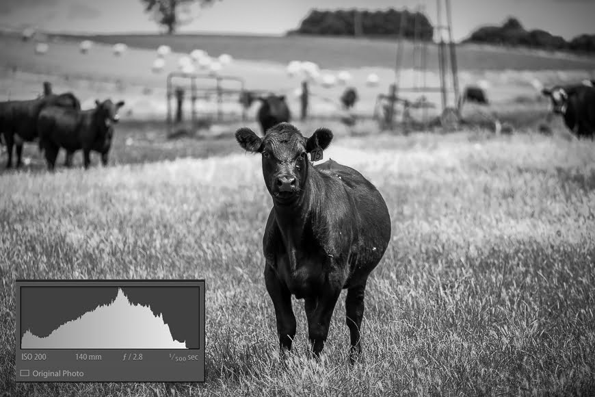
Of course, histograms are going to be influenced by the style of photography you’re shooting. If you’re shooting a landscape where you have the time and proper lighting to compose an image, your histogram is going to appear balanced.
In these cases, your histogram will have minimal pixels at the left(black) and right(white) edges of the graph. There will be a gentle and soft hump of pixel density in the middle of the histogram with no sharp spikes. It represents an image that’s adequately exposed across the entire scene with a suitable level of contrast.
At the other end, if you’re doing some night photography where the light is weak, your histogram is going to appear unbalanced. In this situation, there will be a mass of pixels at the left (dark) side of the histogram and a sharp spike at the far left will be evident. It’s also referred to as a low-key scene.
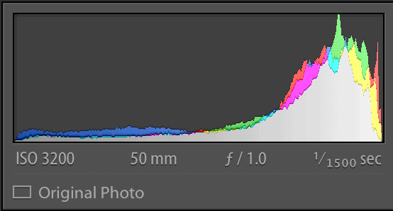
For scenes that have a lot of bight values and perhaps even the brightness of direct sunlight, you’ll see the bulk of your pixels to the far right. Overexposed areas will show the tell-tale spike on the far right with very few pixels to the left half of the histogram. This is often referred to as a high-key scene.
The final typical histogram is that of a scene with high contrast values. In this case, there’ll be a cluster of pixels to the right of the scene. Also, there’ll be a cluster to the left with very little pixel density in the middle.
This may or may not be a bad thing – it just depends on the lighting conditions and the style of photo you’re trying to take.
What Is a Colour Histogram?

So far, we’ve talked about the tonal values of an image. We’ve also discussed how they’re represented in terms of black and white on a histogram.
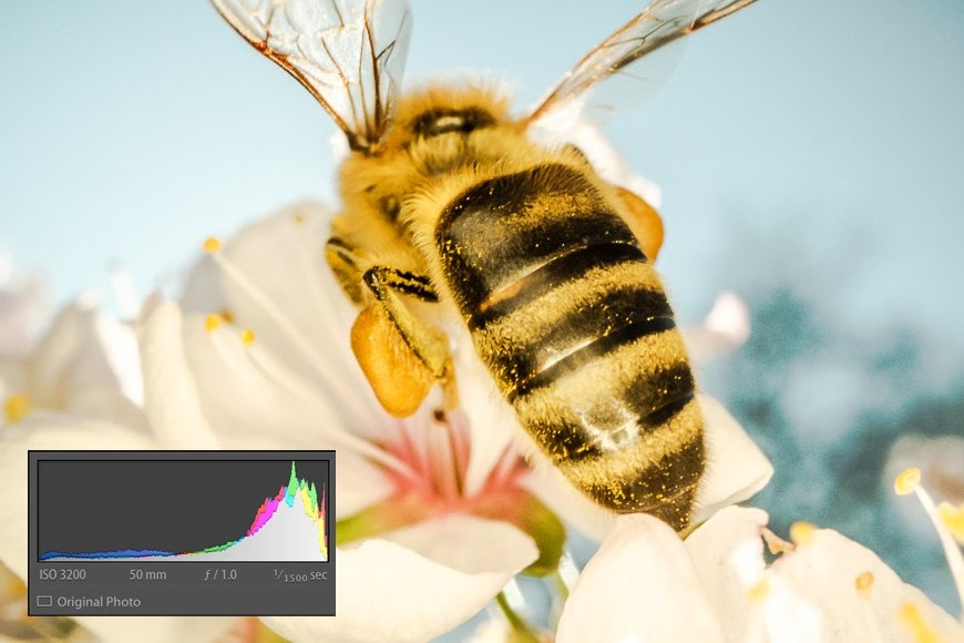
But a histogram also represents the colour values of an image with the primary colours of red, green and blue. This kind is often referred to as an RGB histogram – in fact, you see RGB in a lot of different aspects of photography.
A colour histogram adds a little complexity to reading the graph, but once you get the hang of it, you’ll easily be able to understand it.
The histogram will still show the three colours and the volume of pixels for each. Where there’s a tertiary colour, two of the primary colours will show as overlapping. Where there’s a mix of all three primary colours on the histogram, this will show as grey.
The same rules apply to how data is represented on the vertical and horizontal axis. So if your image has a lot of very dark blue, this will appear as a spike of pixels on the left side of the histogram.
Standout primary colours can even appear as three separate spikes in the histogram such as with the image above.
When to Use the Histogram
As for when to use a histogram, let’s break that down into two parts – shooting and editing.
-
Shooting
Whether you’re out and about or shooting in an indoor setting, a histogram is an essential tool for achieving the correct exposure.
While you can correct a lot of issues with images through editing, some problems cannot be fixed. The details lost in an extremely dark section of an image, or those lost in a highlight, cannot be recovered effectively.
Plus, when shooting a composition, it’s not always possible to see what detail will be lost – after all, you’re viewing the scene through a tiny viewfinder.
But when shooting with the histogram activated on your camera, you have a constant reminder of your exposure values.
By reading how a scene affects your histogram, you can make the necessary changes right there and then to correct your exposure.
If you notice that the scene is too dark due to the bulking of pixels on the left side, you can introduce additional lighting or move to a brighter spot.
If you notice that the scene before you is too bright as the pixels stack to the right with a tall spike, you can change the angle or introduce a filter to remove the harsh light.
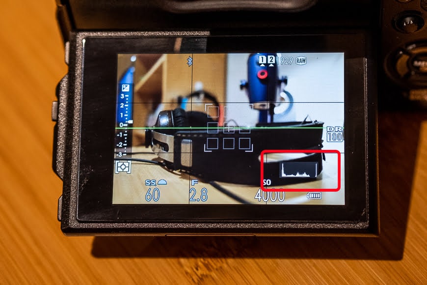
Plus, even after you take a test shot, you can then review the image on your LCD and have the histogram appear.
In some cameras, the histogram that appears with the picture is more detailed. It may even split the histogram into the tonal values graph (black and white) and the three separate RGB colour graphs.
-
Editing
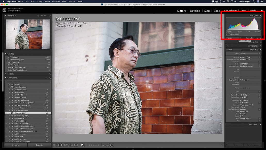
As for editing images, you can use a histogram first to read the tone and colour values of an image and then make appropriate adjustments.
With time, you’ll be able to make the correlation between what you see as the tone and colour values of a photo and how the histogram represents this.
Like any learning, it takes time and patience – but before long, you’ll know what a histogram is going to say about your image before you even look at the graph.
And remember that as you make adjustments to your image, the histogram will constantly update to reflect this. That way, you can see the gains and losses you’re making to achieve a well-balanced exposure in your image.
How Does the Histogram Represent Exposure in Photography?
To give you some practical experience in reading histograms, I thought it would be beneficial to provide real examples. Each represents how exposure is described in a histogram – this way, you can quickly identify how an image impacts the histogram.
This kind of skill also allows you to identify the good and bad examples of exposure.
As we discussed, histograms with spikes in pixels at the very left or right of the graph are generally not good. They represent an image that’s too dark or too bright. And that level of the extremity may also mean you cannot correct the exposure in post-processing workflows. You’re pretty much stuck with what you have.
You can employ this understanding either while you’re taking your photos with the in-camera histogram, or much later when it comes time to edit them. Let’s take a look at some examples with images and their histograms.
-
Underexposure

An image that’s underexposed means that the image sensor on the camera wasn’t exposed to enough light.
It may be caused by the lighting conditions, the shutter speed being too fast, an aperture that’s too wide or a low ISO. This results in an image that’s dark with possible loss of details in the darkest parts of the scene.
When reading the histogram, you’ll notice that the pixels stack to the left (black) end of the horizontal axis. And as we’ve learnt, the right end (white) of the histogram will lack a good number of pixels to balance the exposure.
A spike in pixels stacked against the left of the histogram means there’s lost detail in the shadows. This is also known as shadow-clipping,
-
Overexposure
Overexposure is the exact opposite of underexposure – but let’s explore it a little more than that.
An overexposed image is where the sensor on the camera has received too much light. Extreme lighting conditions cause this due to a shutter speed that was too slow, an aperture that was too wide, or perhaps even too high an ISO setting.
The result is an image that has far too much white and brightness with blown-out areas that cannot be clawed back in editing.
As for the histogram, this time, there will be a significant stack of pixels at the right (white) end of the horizontal axis.
Again, a spike in the number of pixels up against the right-hand side will indicate that there are significant highlight areas and unfortunately lost detail.
This is also known as highlight-clipping, and as with underexposure, there’s not a lot you can do with the image to correct it.
-
Correct Exposure
The gold standard of photography is the correctly exposed image – in most circumstances. If you’re going for a super bright image or a dark, moody one, then underexposure and overexposure are fine within reason.
But for most situations you want to capture at least an image that has correct exposure – you can then play with the exposure later in the editing process.
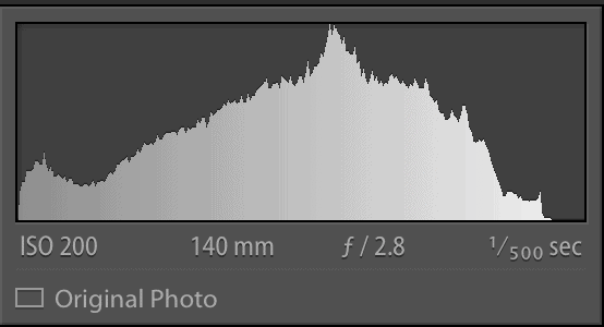
A correctly exposed image will have a pleasing bell-curve shape mostly in the centre of the graph. It indicates that your composition has a great balance of light and dark tones with the majority of them correctly exposed.
It also tells you that there are no spikes at the extremes ends of the horizontal axis indicating areas too dark or too bright.
Well done you!
When You Shouldn’t Set Exposure Using the Histogram

Now you know how to read a histogram and what some of the warning signs of incorrect exposure are. But the question remains, is it accurate to trust the histogram when setting up your exposure?
The answer isn’t a simple yes or no – it depends on what you’re shooting.
If you want to photograph a subject and you intentionally want the exposure to be too bright, then go with that. But in doing so, you know that the histogram is going to show all your pixels stacked high against the right-hand side of the horizontal axis.
You’ll also know that you’re going to have significant highlight blow-out and probably stand no chance in recovering details. But for various reasons such as artistic purposes, you may be perfectly fine with that outcome.
At the other end, you may be wanting to capture a dark and moody scene, or even just undertake some nighttime photography.
You can expect to see a histogram with all of the pixels stacked at the extreme left-hand side of the horizontal axis. You’ll lose image detail in the shadows, but that’s ok. Your composition may be perfectly fine without those details as, after all, it’s nighttime.
Once you’ve trained yourself and had a good amount of practice reading histograms, you have the necessary skills to expand your use of them. In the scenario we mentioned above, the histogram is telling you the images were too light or too dark.
But that’s not always a bad thing, and over time you’ll know how to read a histogram if you want an image to be intentionally too dark or bright. Just be aware that the details are at risk and know how far to push the boundaries of exposure.
What is Shadow and Highlight Clipping?
With images, or image elements, that are too dark (underexposed) or too bright (overexposed), the histogram shows an extreme outcome.
The bulk of the pixels or a spike of pixels will stack high at the extreme right edge, left edge or even both ends of the graph. They’ll be touching the very side of the graph. As we now know, this represents an extremity where image details will be lost.
At the dark or black end, it’s known as shadow clipping. And at the light or white end, it’s referred to as highlight clipping.
These are essential terms to know and understand as you’ll often hear them used in analysing compositions and the images.
If you’re composing a scene and your in-camera histogram is showing highlight clipping, then you need to work with your camera settings to improve the exposure. Depending on the situation, you may be able to increase your shutter speed, reduce your aperture, reduce the ISO or change the lighting conditions.
If you see the graph showing shadow clipping, evaluate your scene and make the necessary changes. Again, you can control your camera settings and slow the shutter speed, open up the aperture or increase the ISO.
Finally, you can add some sort of additional lighting to fill your composition with extra brightness.
Some cameras will also have an exposure compensation function – usually in the form of a physical or digital dial. With this, you can simply increase the compensation value or lower it to manage the values in your final image better – see how do you set exposure compensation?
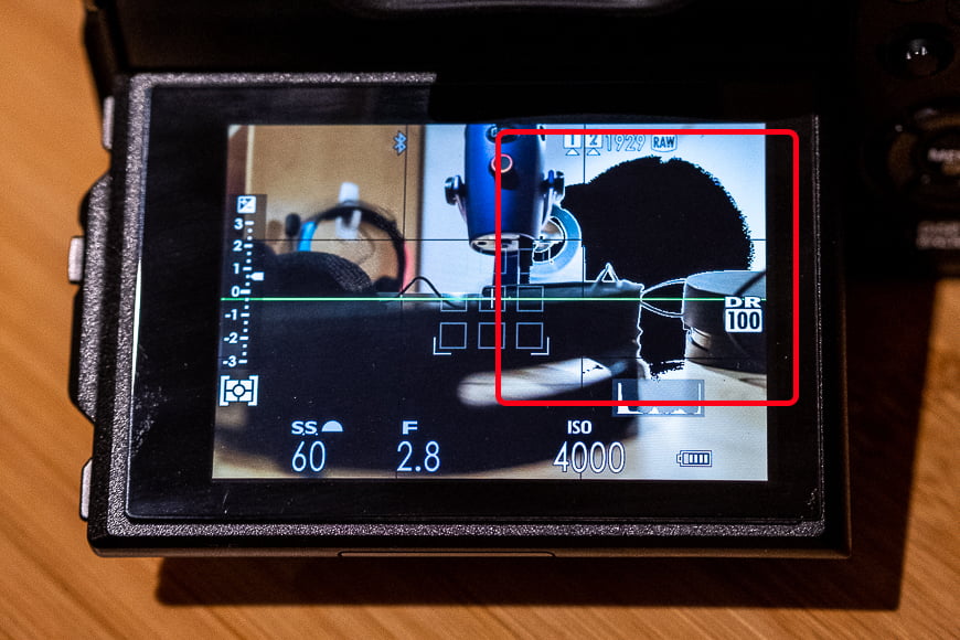
Another way to manage highlight clipping when framing a composition is to set a kind of alarm.
More and more digital cameras have a function that when activated, will provide a visible indicator on the screen or in the viewfinder. Such an indicator will usually show an area of the image that flashes black pixels in an over-exposed setting.
Or, some used what is commonly referred to as Zebra Stripes – literally a zebra stripe pattern flashing on the over-exposed area. That way, you’re warned that your image is going to have highlight clipping. From there, you can decide to continue as planned or make adjustments to your exposure and remove the highlight clipping.
Every camera brand that has this feature will likely name it something different but check with your owner’s manual. You can also search the menus or do a Google search for how to activate it on your specific camera.
How to Interpret a Histogram in Photography FAQs
What does a histogram reveal about a photograph?
The histogram reveals the tonal values of your image. It does this by graphically representing the volume of pixels that the image contains at each degree of exposure, from black (0% brightness) to white (100% brightness).
Why is a histogram important in photography?
Histograms help you measure your exposure, detect clipping or peaking, and create well-balanced images.
What does a properly exposed histogram look like?
Preferably, you’ll want a histogram without any spikes touching the left or right edges – this would represent under or overexposure. A gentle curve with the mass of pixels in the middle would show a well-balanced exposure, however, it also depends on the style of image you’re trying to create.
Final Words on Histogram Photography
Knowing what a histogram is and how to read it is not an essential part of the photographic process.
But with a histogram and your newly found knowledge, you can quickly identify your exposure values and efficiently manage your camera or editing process to accommodate them.
Using a histogram either in-camera or later in the editing process grants you far greater control of the quality of images you create.
Before too long, you will be composing and creating images that even the pros cannot fault.

Check out these 8 essential tools to help you succeed as a professional photographer.
Includes limited-time discounts.
You'll Also Like These:
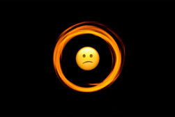 Understanding the Circle of Confusion in Photography
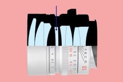 Understanding the Aspherical Lens in Photography (Asph Lens)
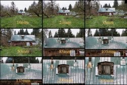 FOV Calculation: Understanding Field of View in Photography
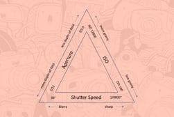 Understanding the Exposure Triangle
 Downloadable F-Stop Chart – Understanding Lens Apertures

I am a Melbourne based street photographer and blogger. I love to travel and make a regular trip to Japan to photograph and document its dynamic culture.


WELCOME TO SHOTKIT
Enter your email to be sent
today's Welcome Gift:
19 Photography Tools
🔥 Popular NOW:


Shotkit may earn a commission on affiliate links. Learn more.